
The advertisement shows the differences between AT&T and T-Mobile's network. This ad is more wordy than their other ads but it still gets your attention because the use of white as the background. AT&T bashes on T-Mobile's slowness and dropped calls. They show one picture on the bottom right of the ad which is a phone with black actors/people on the screen. That displays the race and gender of the ad which shows both genders in a friendly looking setting. They use the color orange which stands for excitement, enthusiasm, and warmth. Putting this advertisement together shows healthy competition.
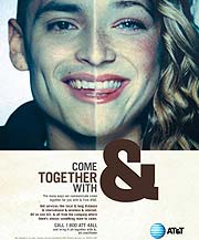
This was a part of an 2008 ad campaign. The main target market was to consumers, businesses and government customers. Connie Weaver, AT&T's top marketing executive at the time said, "try to shed the image that we're just a long-distance company, just a voice company. AT&T is an advanced technology company." They were really into making it personal and tried to shed their "stodgy image". Gender plays a role in this ad by totally cutting out half of both of their faces and putting them together so they look like one head. I believe it's suppose to show that everyone is coming together/being family. The use of a big & symbol stands out. The words are popped out against the white/cream space at the bottom of the ad.

This "Hands" campaign happened around 2009 and launched.... They used very little words in the ad. AT&T used information and attention approaches with bright colors and actual information. They used real hands to shape something famous from that country, in this case, the Great Wall of China. The hands are completely covered and you can't tell if it's a man or woman's' hands. This says that anyone can use their phones. AT&T is displayed right in the middle of the ad and it's the lightest part of the ad. My eyes tend to look right at that first. The images are well layed out, starting in the middle and then working your way to the hands. It flows easily and it's implied that everyone knows famous landmarks.
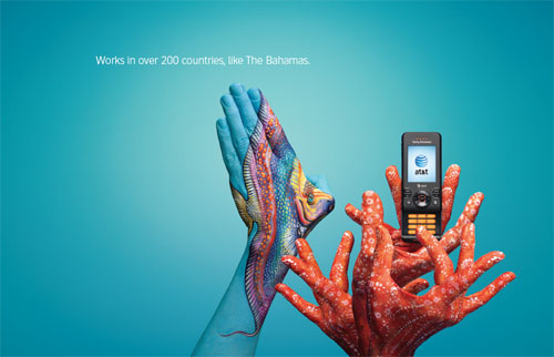
Here is another ad from the "hands" campaign. This one is for the Bahamas. This time AT&T is featured on the right side of the ad but we can still see that it's the lightest part of the ad. Again, it uses information and attention approaches. I would also say association because people can associate with the places the ad shows, like the Bahamas. They use bright colors and art to lay out the image. The hands are covered in this ad so I must assume both genders can use this phone. They only use one sentence in the ad and it's straight to the point.
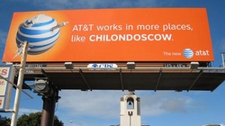
AT&T also uses billboards for their ad campaigns. This one is a lot like the hands ads but without the hands. The main idea is that they have expanded and can be used in many different places. The ads showed made up cities that are actually a combination of three different cities the network works in. Like Chilondoscow is China, London, and Moscow. This clever idea mixes in the attention and entertaiment approaches. They also use repetition with the logo. I believe this ad campaign did a great job overall making the consumer remember the service.
